I’m going to show you how to create a portfolio section on your WordPress website.
For any many companies (such as web design agencies) and freelancers that work with digital media its important to have a portfolio section on your WordPress website.
I’ll show you how todo this using WordPress Custom Post Types, you’ll easily be able to update the portfolio via the WordPress admin interface without having to write extra html or css.
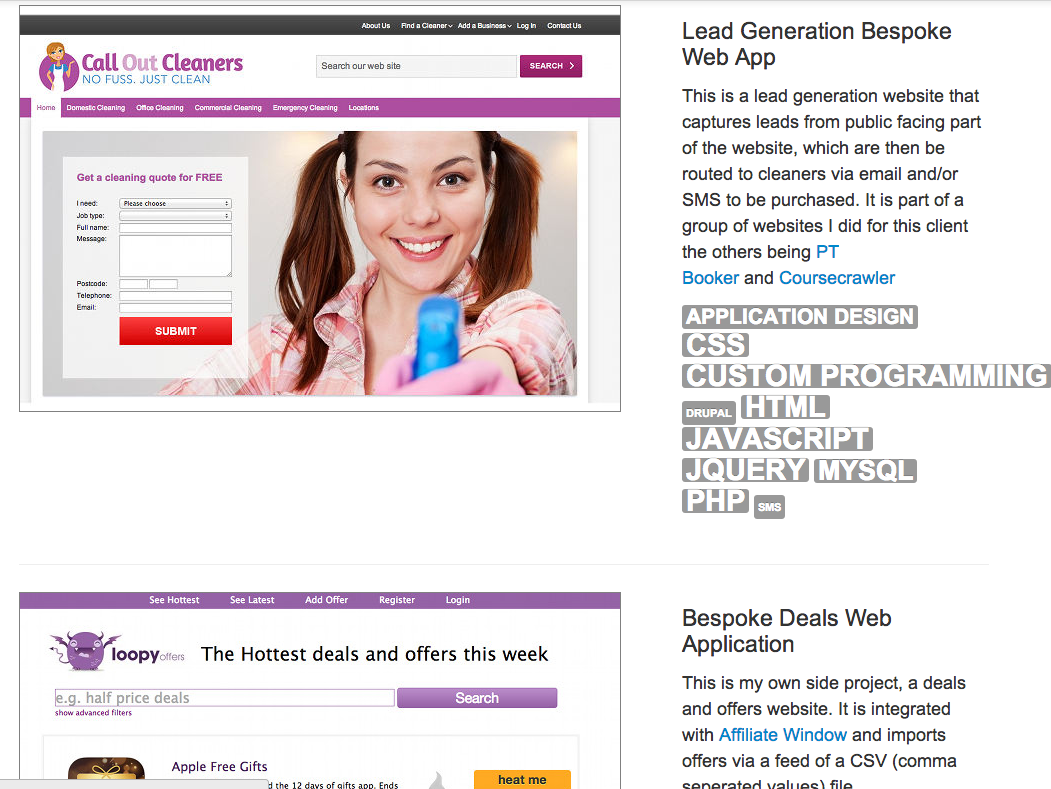
As I’m a WordPress Developer my portfolio section will focus on showcasing WordPress programming and web design. See the finished version here.